I had an idea for a cool Pickleball shirt designed around what players like to say at the start of a game. “Zero Zero Start!” There is something magical about this phrase to me as a Pickleball player. When I hear or say it, my mind focuses and gets this shot or adrenaline and excitement. The game is now on!
Technically the score at the beginning of a game is “Zero Zero Two” but most of the people I play with say “Zero Zero Start”. I’m also a fan of saying “Start” so it’s what I decided to design the shirt around.
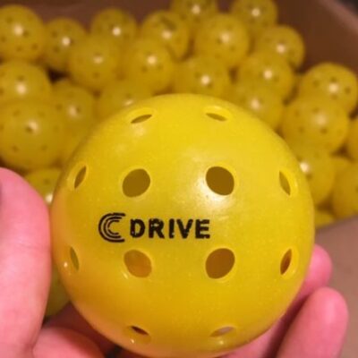
I also wanted to start making more “Calvin Keeney” products as I built my personal brand. My first product was the C DRIVE Pickleball that I designed the logo for a few months back.
As more and more of my pickleball friends became sponsored by bigger companies. The more I wanted to get a sponsor. And who better to sponsor me than myself?! I’ve learned you gotta love yourself before you can expect others to do the same.
What Makes a T-Shirt Great? Pre Planning How I Wanted My First T-Shirt Design to Look
I studied hundreds of other shirts online. Browsing through them to see what caught my eye. Was there a theme in what I liked? Are there certain aspects of tshirt designs that I didn’t like? These were questions I was asking myself as I looked through many t-shirt designs across the web.
What Makes a Good T-Shirt Design?
I came to several conclusions throughout my research. Here are some characteristics that I believe make a great shirt:
- It’s meaningful to the person wearing it
- The message is understandable by most people looking at it
2b. Or is easily explainable when asked “what does your shirt mean?” - Is easily understood from afar (10 ft. plus) – Text and Images/Icons are clear enough to see from afar
- Simple design
- Looks “cool” or “neat”
- It has to feel comfortable (I rather wear a shirt that is comfortable with no text than an uncomfortable shirt that meets the other 5 criteria above.)
One of the #1 aspects that the t-shirt design had to meet was “Am I willing to wear it often?” The answer to this question for me personally had to be yes because I was going to be investing lots of time and money into the product. And because it was my first shirt to represent my personal brand, I would be wearing it a lot.
With that in mind I was able to move forward in creating the first concept designs of the shirt. My plan was to keep these characteristics in the back of my head as I designed the t-shirt as a whole.
Initial Concept Art I Created for the “Zero Zero Start” T-Shirt
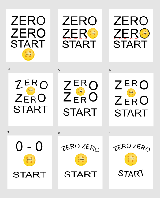
I wasn’t sure what I wanted the shirt to look like. I knew I wanted it to say “Zero Zero Start” and to have a pickleball on there somewhere. So I began with the 9 pieces of concept art above.
Next step was to see what others thought looked good.
Reactions from Friends and Family About My Initial Designs
I reached out to people asking them their thoughts on the overall design of my 9 initial concepts (see above). #2, #3 and #7 were all close to first place with 12+ votes each. While design #1 trailed close behind them with 8 votes.
Several voters commented that #7 looked a lot like a face. So I decided to see if I could exaggerate that in the next round of votes alongside different versions of #1-3.
The Second Round of Concept Art for My First “Calvin Keeney” Branded T-Shirt
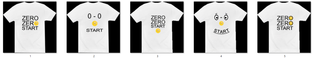
I spent a bit more time working on 5 designs based on the top 4 from above. Some of the designs I left the same while others I tried making them look more consistent with the size of text and pickleball.
The new smiley face shirt looked really fun. I spent WAY more time working on this design than any of the others. It was hard to make it look like a smiley face while still reading “Zero Zero Start” well enough.
Overall I was happy with the 5 updated designs and was interested to hear feedback on how they looked placed on a mock up shirt.
Reactions from Friends and Family About My Phase 2 Designs
Designs #1 and #5 were the clear winners of this vote. The smiley face (#4) was behind them in third place by about half the votes but still had some love for it’s innovative design.
People seemed to either love it or hate the smiley face design. While most voters either liked or were neutral for #1 and #5.
I liked all 3 of these designs and began thinking of what I wanted to wear most. However, as I was doing this I realized that I needed to learn more about what options I had to print these shirts.
Learning More About the T-Shirt Printing Process Before Making My Final Round of Designs
I’ve never went through this creative process before and noticed how little I knew about the actual printing of a design on a t-shirt. So I set out to learn more.
One of the first areas I studied was different styles of printing t-shirts. This was a very helpful video on t-shirt printing methods that I watched at 2x speed to soak up the knowledge faster.
Working with T-Shirt Printers in the Austin, Texas Area
Now that I knew the different styles of printing, I went to local tshirt design companies to figure out what method I wanted to do. Between Direct to Garment (of “DTG) and screen printing, I ended up going with screen printing because it was the most common and efficient method for my 50 shirt project.
The one downside was that I couldn’t make the actual pickleball on the shirt look as realistic. It would need to be just one collow of yellow but I was ok with that.
When I got home I watched this cool video at 2x speed to help me understand the basics of screen printing. This allowed me to create a better final design based on what the screen printing process was capable of.
I ended up having my shirts printed at Oh Boy! Print Shop here in Austin, Texas. You can find out info on having your own shirts printed there through that link. With them, I paid per different color used on the front and back. Along with the cost of buying the premium shirts I chose in bulk.
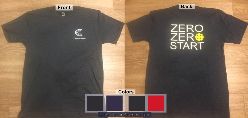
Final Design for My Very First “Calvin Keeney” Branded T-Shirt
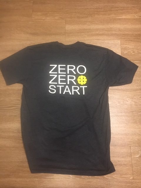
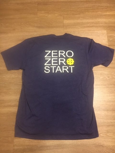
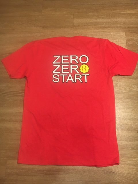

Pictured above are the final designs and colors that I had printed. From left to right:
- Front of Shirt
- Charcoal (Black)
- Storm (Dark Purple)
- Red
- Royal Navy Blue
I settled on this final design for my pickleball shirt and was happy that it met many of the characteristics of a good shirt that I thought out before.
- The shirt would be meaningful to pickleball players.
- Easily explainable to non pickleball players (“It’s the score a lot of people say to start a pickleball game”)
- You can read it well from afar.
- The design is very simple and looks neat.
- And it feels soft and comfy!
I was very proud of my first t-shirt design. The end product was not quite what I agreed on with the printing company. All of it was good except the sizing of the images on the front and back. I’m not sure where the communication messed up but the final design was off by a bit from what we agreed on in the mock up.
All in all though I am very happy with how the shirts came out and I would be interested in using the same printer for future shirts.
Where to Get Your Zero Zero Start Pickleball T-Shirt?
I currently sell this shirt in person for $20 or on Amazon here.
Let me know if you want to buy a shirt for you or a friend. You can contact me here or tell me the next time we cross paths.


Leave a Reply
You must be logged in to post a comment.